The Most Common Problem with Bad Tattoos (and how to Fix it) With Jake Meeks
15 September, 2023If you have been tattooing for a while, you have most likely encountered the issue of having to follow up behind an incompetent tattooer and make an effort to fix their bad tattoos.
In today's episode, Jake covers what he considers to be the biggest challenge when dealing with this issue. It's probably not what you think. Enjoy!
Topics: Bad Tattoo Rework, Tattoo Coverups, Tattoo techniques
What to Address First when looking at a Bad Tattoo
“Typically the technical ability of the tattooer that you are following up behind isn't the biggest problem to solve, in my experience…”
When we think about reworking or covering bad tattoos, we typically focus on the technical skill (or lack thereof) of previous tattooer. We talk about blown out lines, spotty color and scarring. However, in my experience, these are not the biggest obstacles to overcome.
The One Thing Tattoo Artists Can’t Control
“What this tattooer failed to recognize is how important the shape of the body is. That is the one thing that we don’t have any control over”

The most common issue (and the one that should be addressed first) is the shape of the body and how the existing tattoo relates to it.
In this example, the previous tattooer ignored the flowing shape of the client’s thigh and designed a series of shapes that acted as roadblocks, disrupting the natural flow of the client’s hip and thigh.
Covering up Bad Tattoos
An Attempt at Solving the Problem

“The first thing I did was to introduce these sweeping leaf shapes in an attempt to lift the viewer's eye and move it through the composition…”
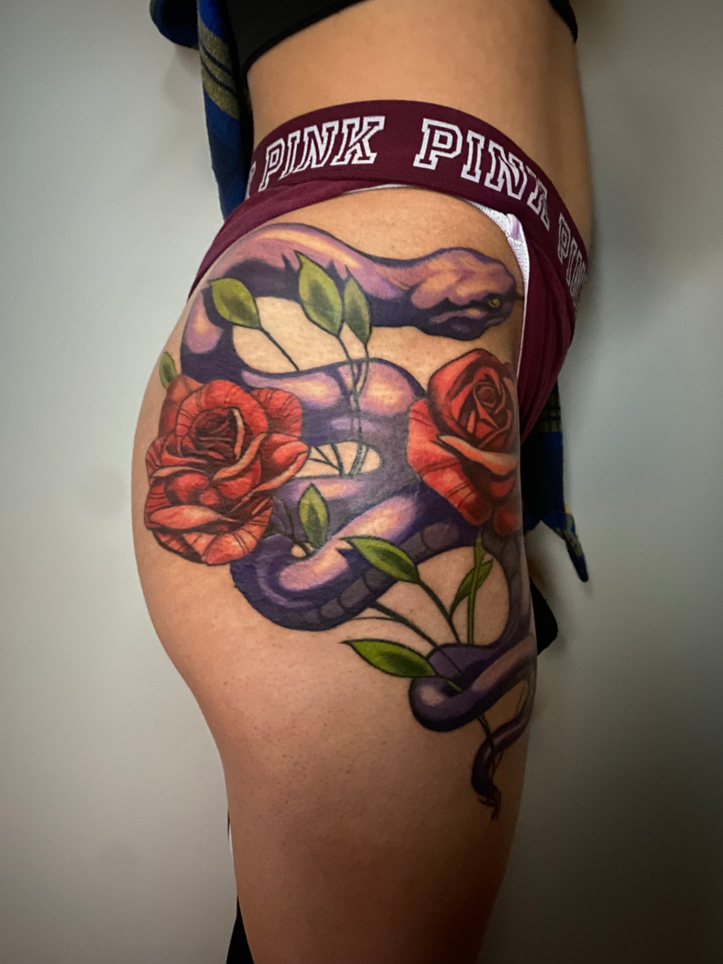
My first goal with this piece was to introduce some secondary element that would break the hard horizontal shapes that the previous tattooer had introduced. I chose to use a few very simple leaf shapes to solve this problem. I wanted to be sure that the leaves looked as if they were part of the original design, so I had some of the leaves fall behind the snake and others fall in front of it. This required that I tattoo right over the harsh lines of the snake, which wasn’t ideal, but sometimes we have to sacrifice perfection in order to make some progress.
I was able to distract from most of the bad linework by introducing a strong light source and turning the outlines into edges/transitions. Most of my problems were solved (as much as they could be) before I introduced color. Here is a photo of the finished piece.

While the tattoo still has issues (I never was able to completely solve the problem with the roses) I feel like overall I was able to successfully distract the viewer from the shortcomings of the piece by establishing a hierarchy within the composition. By using strong value contrast and a deliberate light source on the body of the snake, attention is pulled away from the weakest areas of the tattoo and focused on the strongest parts.
Thanks for reading!
Learn more about Jake Meeks and the Fireside Tattoo Network at
https://www.firesidetattoo.com/
[Headline Placeholder]
-
Best Seller

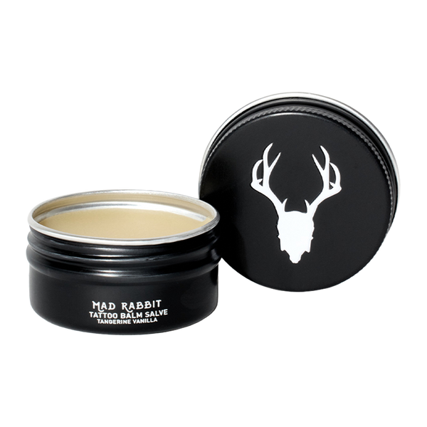
 Tattoo BalmEnhance tattoo brightness after 1 useLog in / Register to view price40-60% Off
 -
Best Seller
-v1712785206587.jpg?1125x1000&transform=resize=562x499)
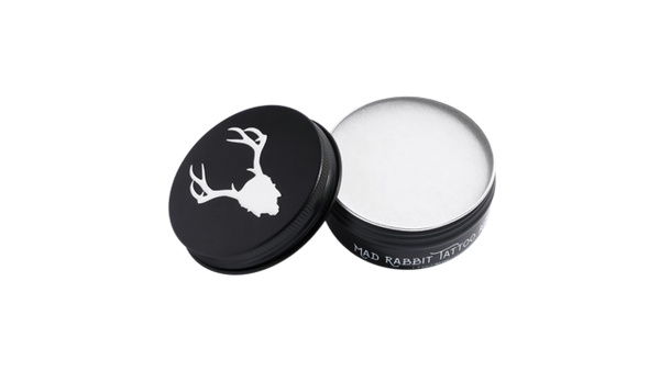
 Tattoo Balm StickEnhance tattoos on the go with unscented, portable aftercareLog in / Register to view price40-60% Off
 -
Best Seller

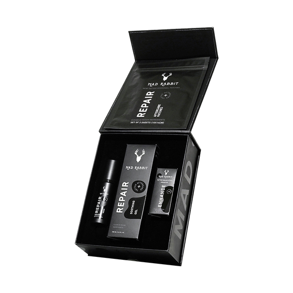
 Tattoo Soothing GelRepairs fresh tattoos in 14 daysLog in / Register to view price40-60% Off






Join the discussion